Jyut Ping Bar
Branding and Identity
Graphic Design
A conceptual brand exploring ways to immerse visitors in the Taishanese language through a community hub experience. The project draws from the cultural roots of Taishanese and the history of Chinese emigration to the West, reinterpreting traditional symbolism to create a fresh, contemporary identity.
Visual elements balance heritage and modernity, bridging Chinese linguistic tradition with contemporary culture for a new generation of Taishanese speakers. The result is a brand concept that is authentic, inviting, and culturally resonant.
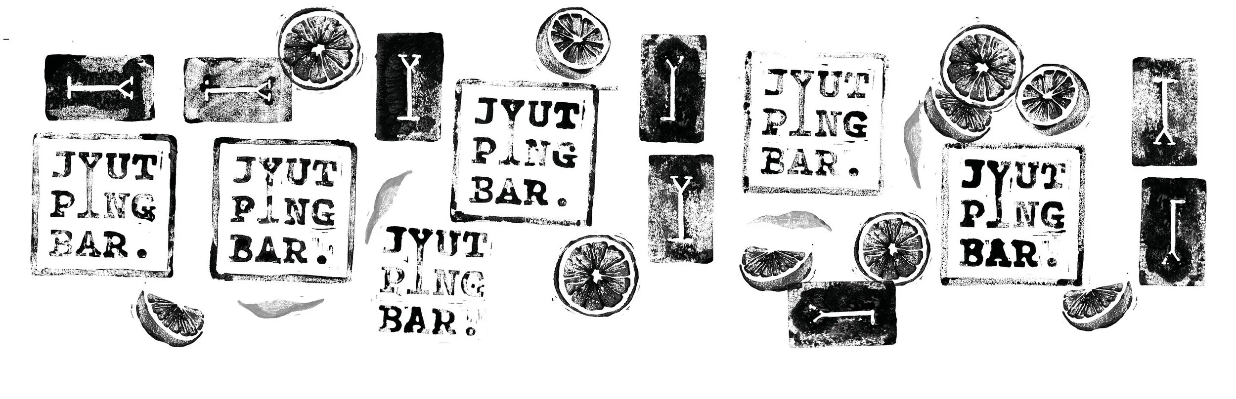
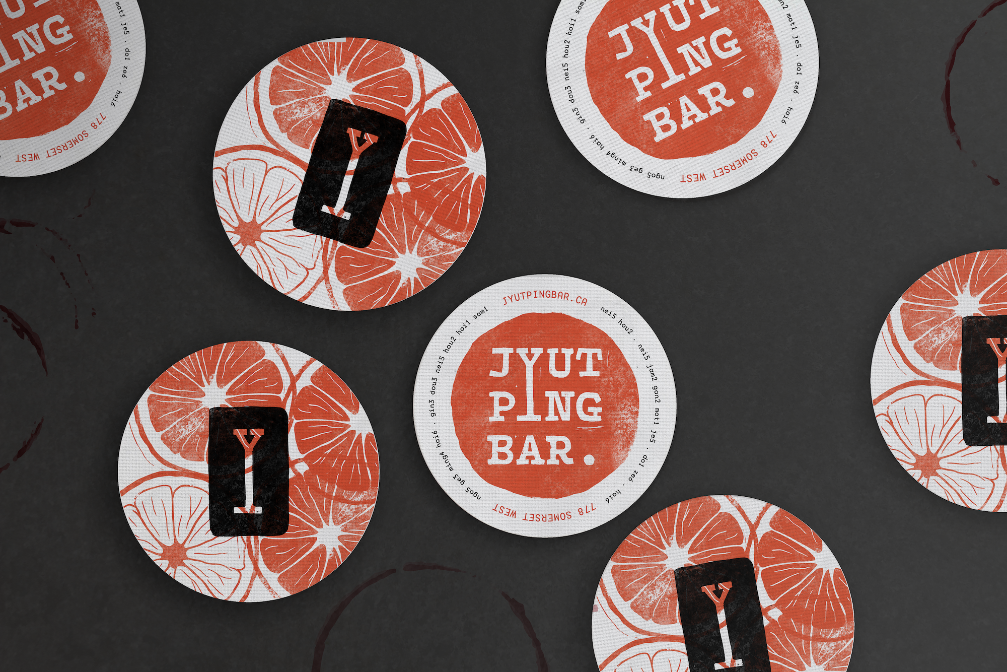
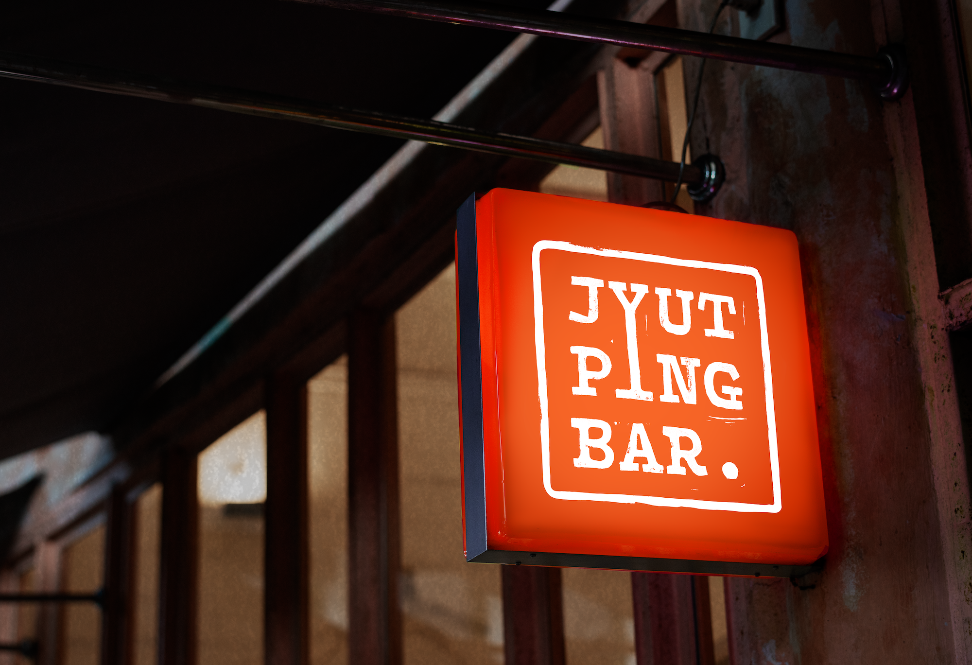
Handcrafted linocut gives the logo and logotype a distinct character with unique textures. This style of printmaking is reminiscent of the stamps associated with 1950s Chinese emigration papers.
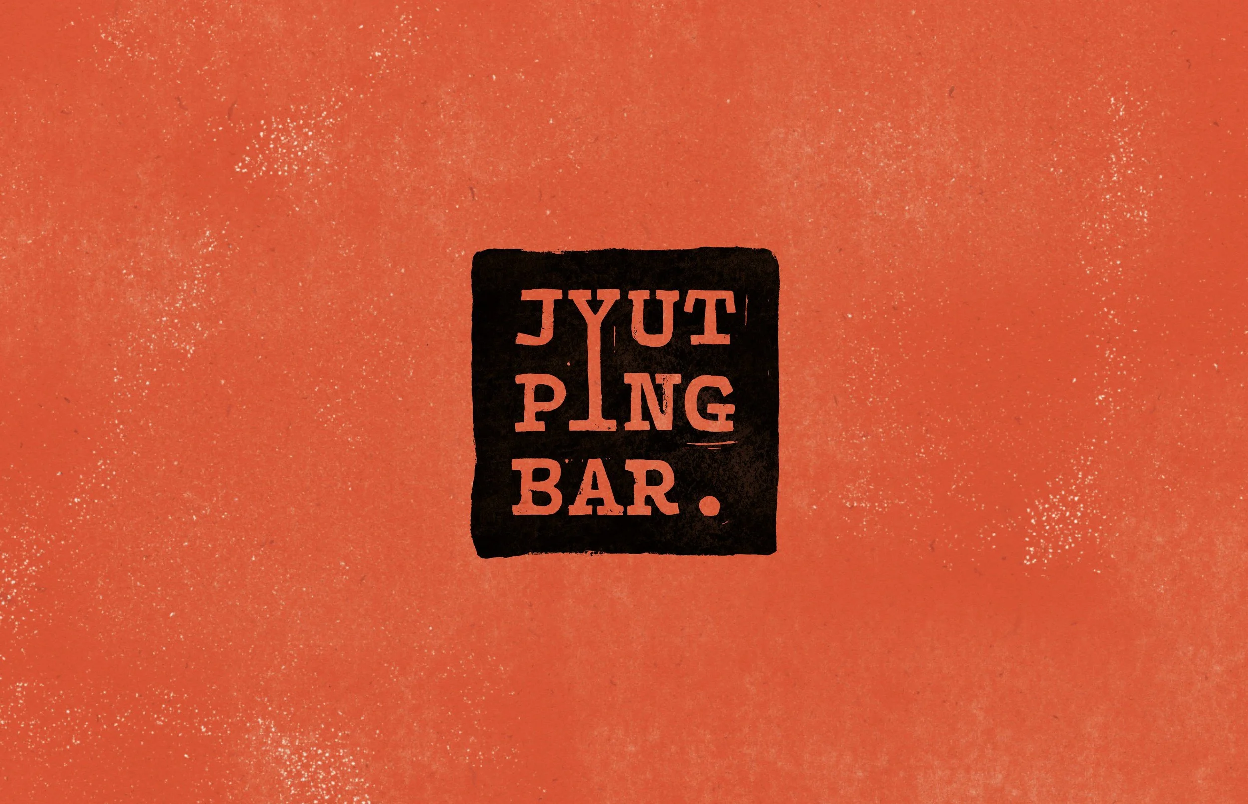


Jyut Ping Bar’s typographic system takes inspiration from printmaking media and 20th-century emigration documents. The headings reference the blocky, misshapen fonts often produced in printmaking practice. The subheadings and body copy make use of a typewriter-like mono slab typeface. This type pairing reflects the traditional and modern visuals associated with Taishanese while also bringing a contemporary feel to the brand identity.

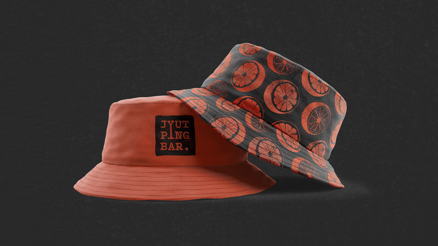
The Jyut Ping Bar colour palette reinterprets a culturally popular Chinese colour scheme. The traditionally red spot colour is replaced with a vibrant red-orange. This colour shift brings a sense of energy, youth, and modernity to the brand.

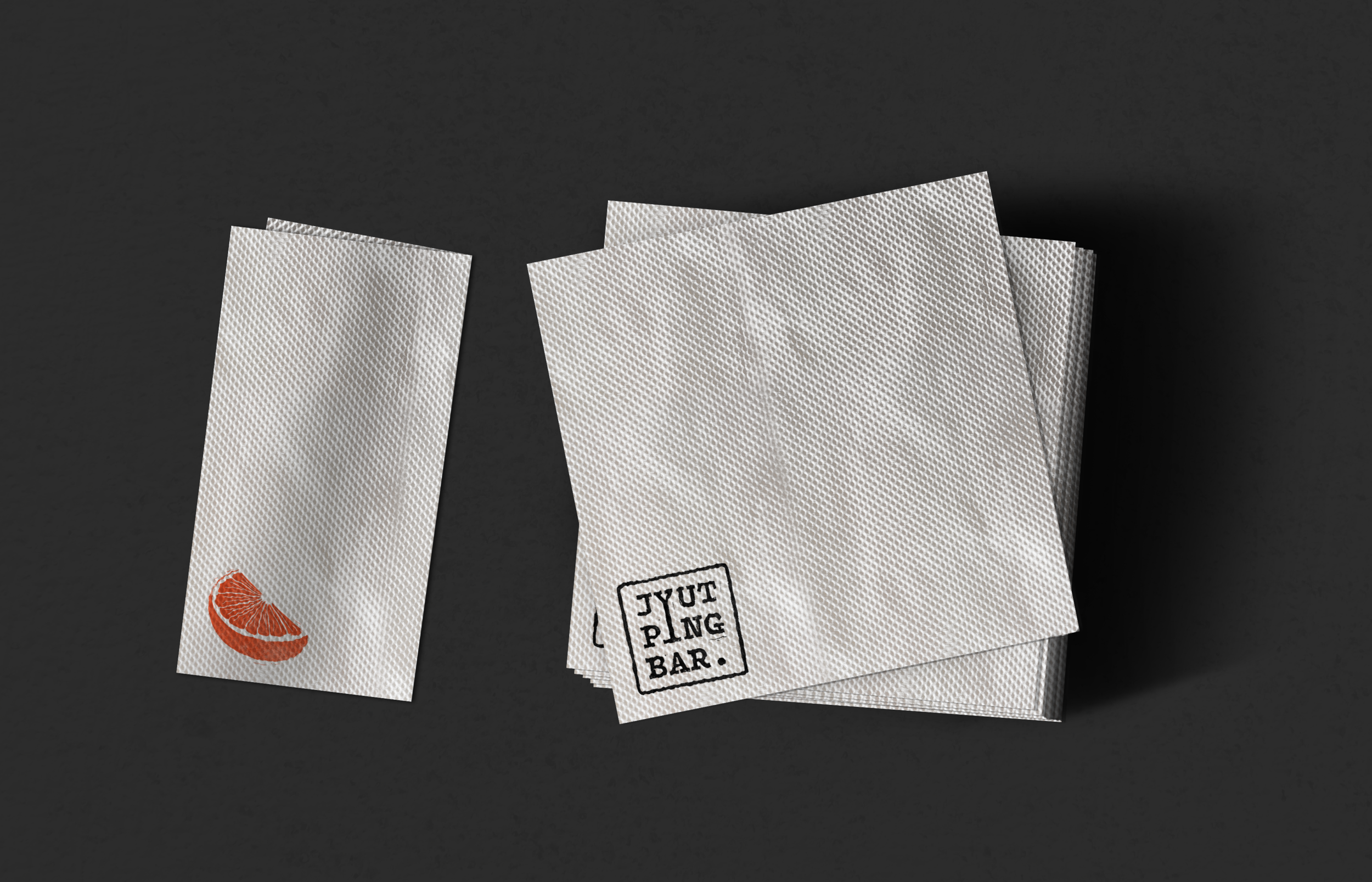
The extended visual language of the Jyut Ping brand uses an orange motif in various forms. In Chinese culture, oranges are a symbol of good fortune and are typically shared at social gatherings. Because of this associated heritage, the orange imagery is an appropriate representation of old and new social traditions. The orange iconography extends further to the bar concept of the brand, with orange being a popular citrus in many cocktails.